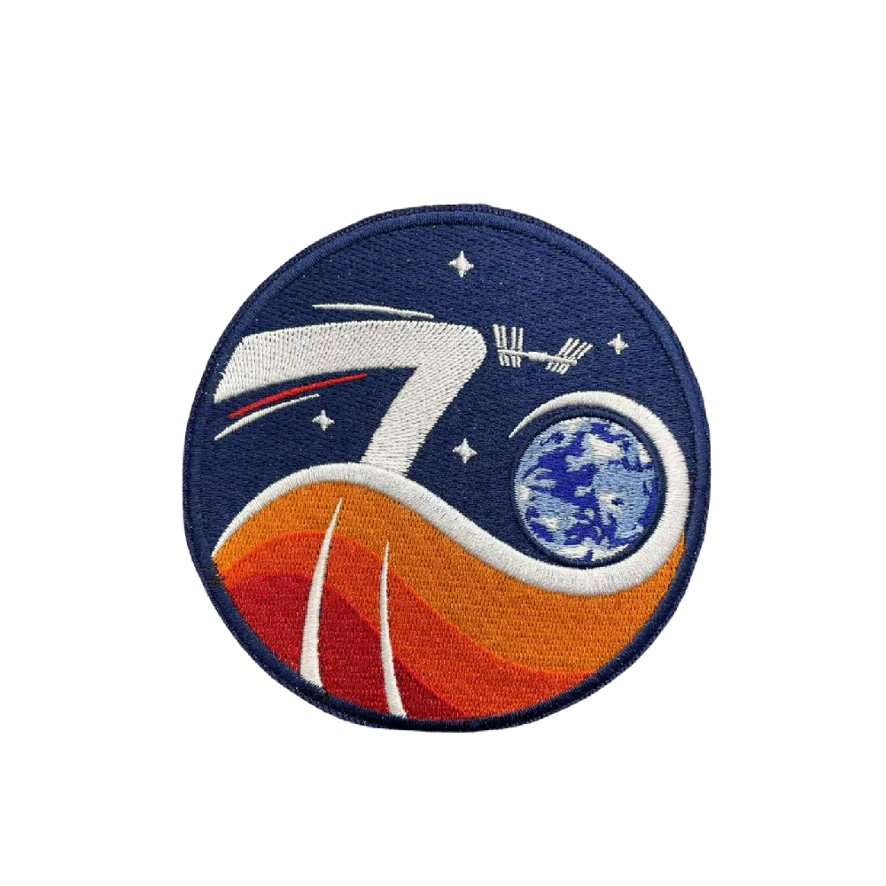
Expedition 70 Patch
Expedition 70 Patch
The patch for Expedition 70, designed by ESA graphic designers Hugo Simões and Hugo Dias, is based on 'yinyang', the well-known philosophical symbol of balance between two complementary forces — yin and yang — that make up all aspects and phenomena of life. In this depiction, the red and orange tones in the lower half of the patch represent science and and the dark blue represents space exploration in the upper half.
The Expedition number ‘70’ is suggested by representations of the Space Station’s orbit joined by the plume from a launcher forming the ‘7’ in white, followed by the ‘0’ as a white orbit which, after circling Earth points into the dark background, hinting at future deep-space exploration. Red, white and blue trails join the Space Station orbit, the colours from the flags of the four participating nations (Denmark, Japan, USA and Russia).
Our planet, in blue and white, is surrounded by the white orbital ‘swoosh’ of the ‘0’, representing the themes of climate research and benefits of science for life on Earth. The four stars represent the four crew members, as well as the four participating nations.
Although there have been Expedition patches designed by European artists before, this is the first time that ESA has provided an Expedition patch design.


